02 / SOULBOUND LABS
2026
Keylark
Designing an AI that leases apartments without losing the landlord's trust
Visit getkeylark.com- FOR
- Small landlords with three to thirty units and no staff, leasing where renters already are.
- ROLE
- Founding designer. Brand direction, art direction, graphic design and UX were all mine, along with product design, positioning and product direction. Feature set decided jointly with my engineering co-founder. I designed and built the operator console and marketing site working with Claude Code. My co-founder built the agent backend and the Marketplace channel.
- TEAM
- Two: me and my engineering co-founder.
- TIMELINE
- June to August 2026.
- STATUS
- Ran in production with real operators in 2026, then wound down with the studio.
- PLATFORMS
- Web operator console, marketing site, Android companion, API backend.
Impact
RAN IN PRODUCTION, 2026
Ran in production with real operators, designed and shipped by two people in about three months.
WHAT IT RUNS ON
$27
a month, roughly, for all of production
A multi-tenant product on a single VM, running end to end: signup, a provisioned workspace, the seeded demo, and the AI answering real SMS.
3
applications, plus the marketing site
The operator console, the Android companion and the API.
2
people
I designed and built the console and the site. My co-founder built the agent backend and the Marketplace channel.
Background
Small landlords lease on Facebook Marketplace because that's where renters are, and then they drown in it. Dozens of near-identical messages arrive at all hours. Still available? Can I see it Saturday? Most go nowhere.
The operators I designed for have three to thirty units and no staff. They didn't want a CRM. They wanted their evenings back.
That became the north star and the sharpest constraint at the same time. The product's job is to be absent.
Problem statement
Small landlords were drowning in rental inquiries at all hours, with no staff to answer them. An AI that replies to prospects on their behalf is a trust problem before it is an interface one: it had to be fast without ever speaking out of turn.
The decisions
01The trust model came before any screen
The riskiest sentence in this product is "an AI texts your prospects for you." No amount of interface polish survives that sentence unanswered, so the first thing I designed was a state model rather than a layout.
Every conversation lives in one of three states. AI handling, invisible by design. Needs review, where the agent holds a draft and waits. You took over, where the human owns the thread until they release it.
On top sits a global switch. Review mode, where every reply is a draft requiring approval, or Running mode, where the agent acts and only escalates exceptions.
Trust in automation isn't binary and can't be requested up front. New operators start in Review, watch the agent draft good replies for a few days, then flip to Running themselves. The moment of granting autonomy belongs to the user, not to my onboarding flow. The toggle sits in the header, always visible, because knowing you can take the wheel back is what makes handing it over tolerable.
THE TRUST MODEL
Three states and one switch, designed before any screen.
FIG 03 THE STATE MODEL, IN THE THREAD
Autonomy the operator can see, set, and take back.
An agent that replies on someone's behalf is spending their reputation. So every thread has to answer three questions without being asked: who is speaking right now, what happens next, and how do I stop it.
The answer lives in the thread header, not in settings. The current state is always visible, and the control that changes it sits right beside it. Agency is granted per conversation and revoked in one click, which is the only kind of delegation people extend to a system they are still getting to know.
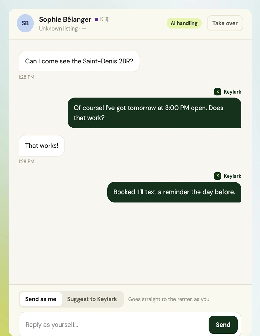
The default, and deliberately quiet. Keylark answers, books the viewing and schedules the reminder. Every message is attributed, so the record reads cleanly later, but nothing asks for attention. The best outcome in this state is that the operator never opens it.
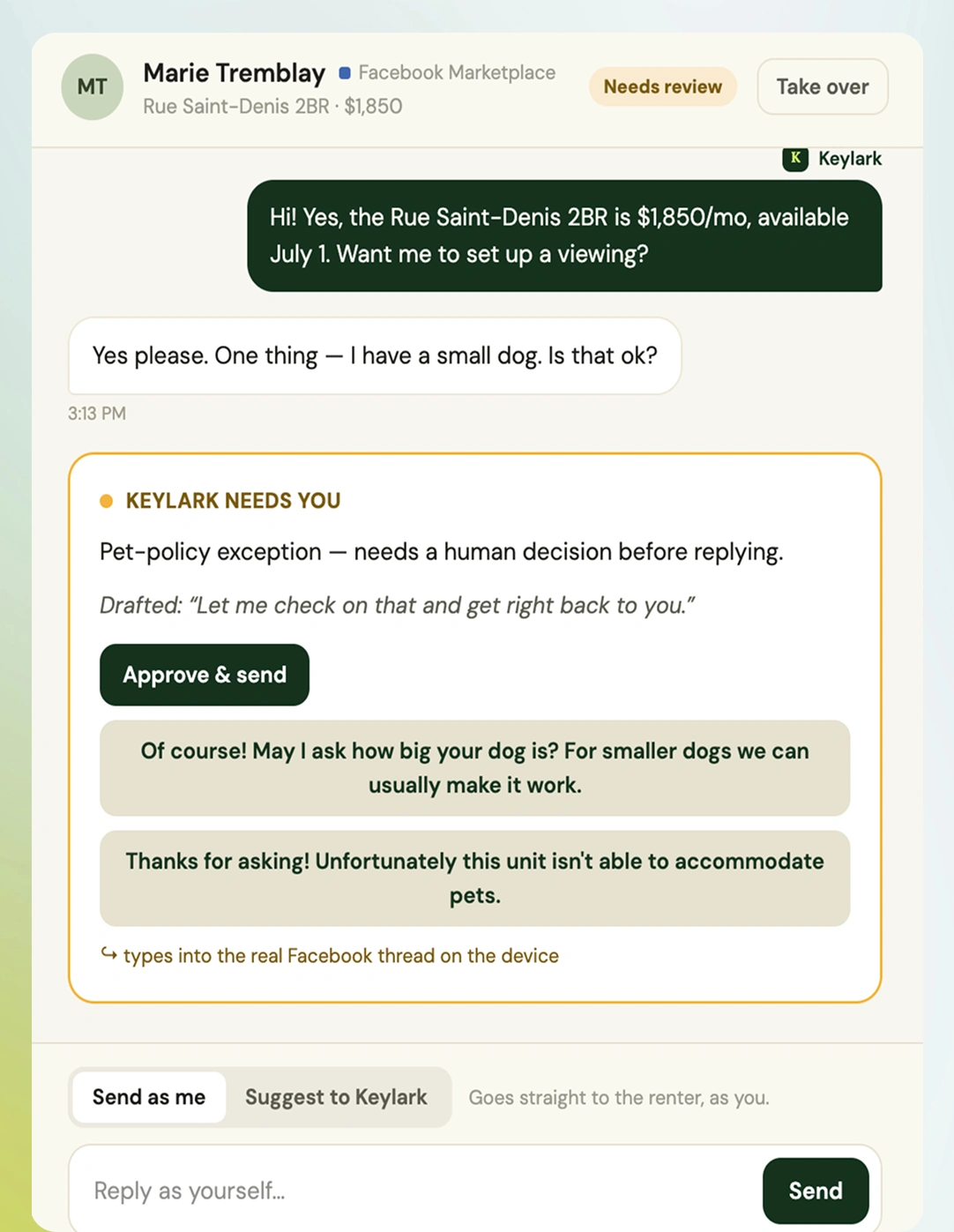
The agent stops at a line the operator drew, here a pet-policy exception. The escalation arrives as a decision rather than a notification: a draft is already written, with alternatives for the likely answers. Approve, pick another, or write your own. Judgment costs seconds, which is what makes asking for it sustainable.
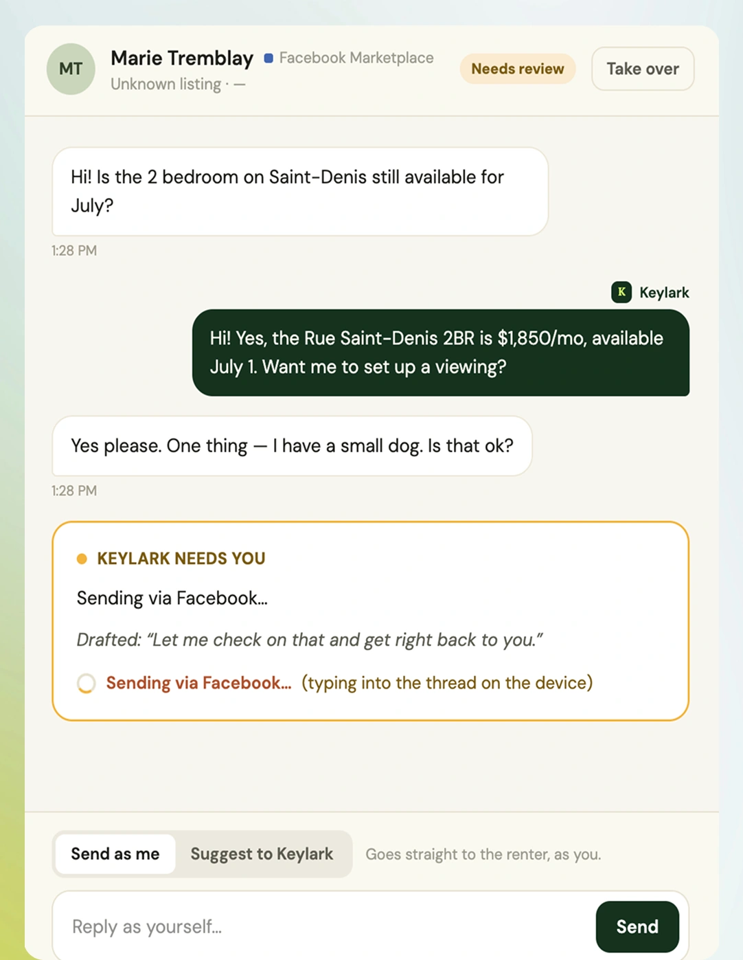
Marketplace has no messaging API, so a reply is typed into the real thread on the operator's device. The card says exactly that while it happens. Indirect transport has to be visible, or a slow send reads as a broken one.
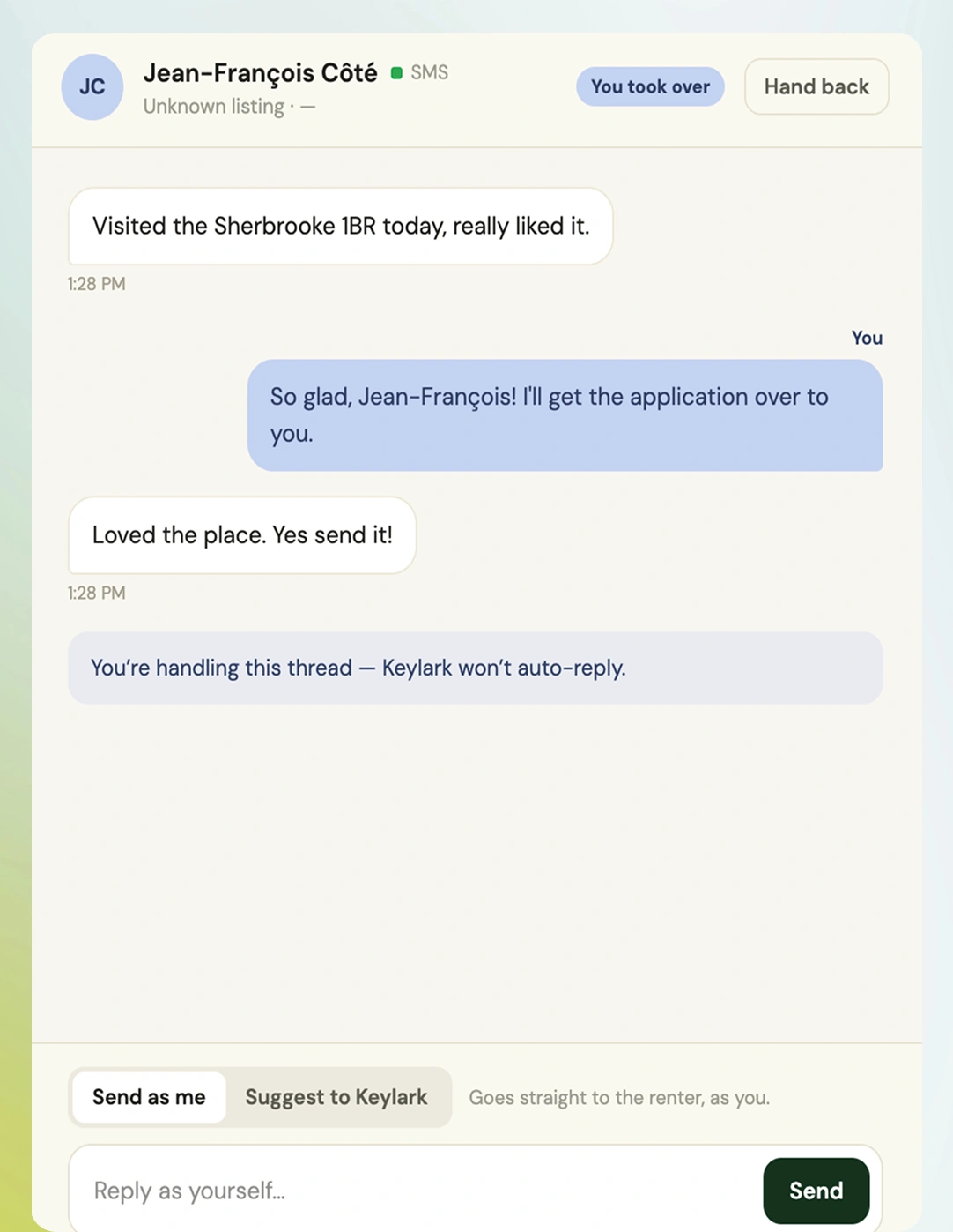
Take over is one click away on every thread, in every state. Once the operator speaks, Keylark goes silent and says so, and it stays silent until they hand the thread back. Control that quietly expires isn't control.
01 / 04 AI HANDLING
Delegation is per conversation.
Operators don't trust an agent in general. They trust it with this renter and this question. The unit of consent matches the unit of risk.
Escalations arrive answered.
Asking a human for help only stays cheap if their work is a choice, not a blank page. Every escalation carries a draft and alternatives.
The human voice always wins.
Taking over is instant, total and sticky. The composer asks the same question at the smallest scale: send as me, or suggest to Keylark.
02An inbox that only speaks when something is wrong
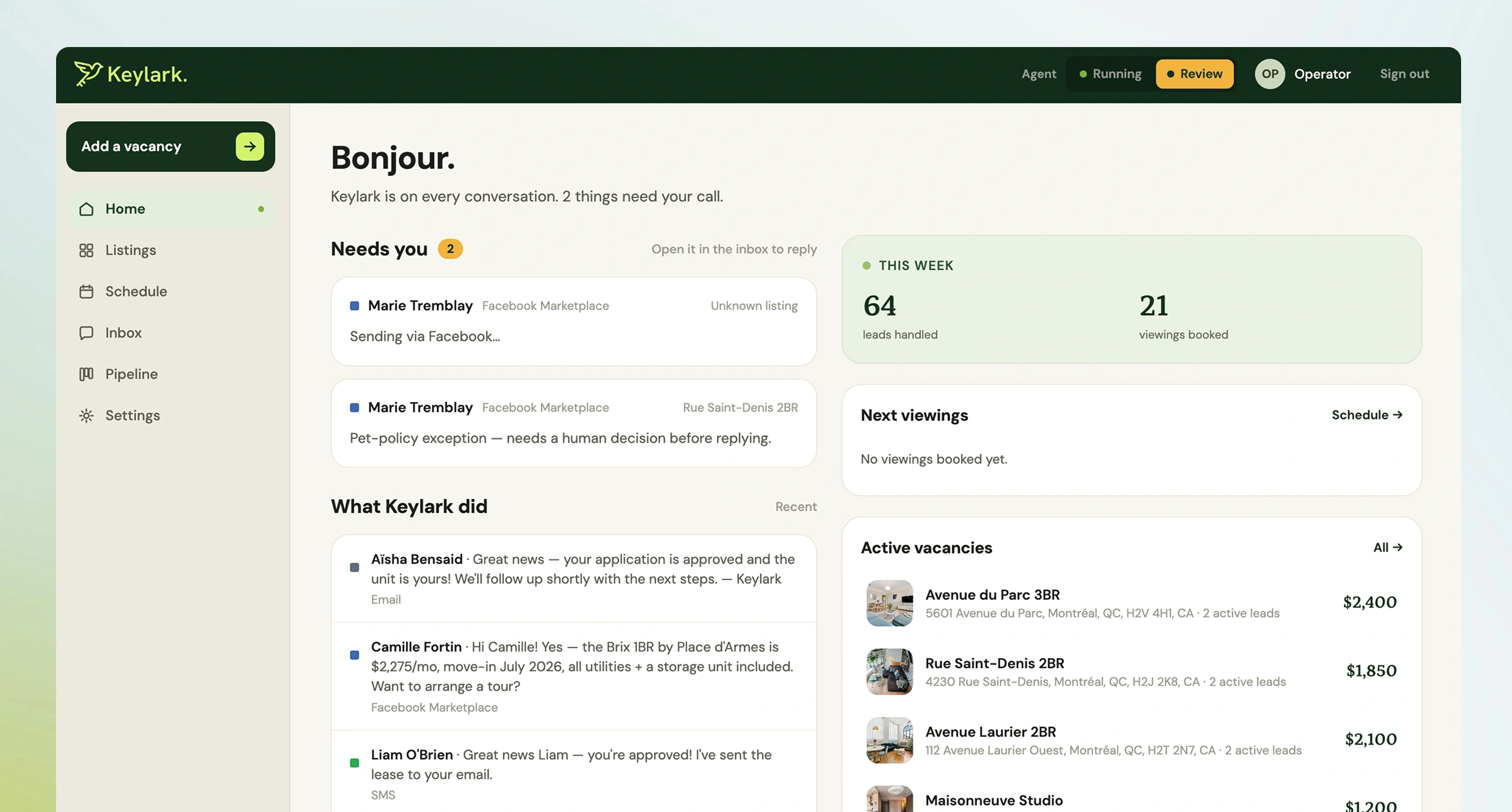
My first inbox looked like every SaaS inbox: status badges on every row, activity everywhere. Seeded with realistic volume and actually lived in, the failure was obvious. The AI's successes were visually shouting over the three threads that genuinely needed a human.
I rebuilt it around exceptions. One-line status tabs, chips reserved for errors and escalations, and a "Needs you" section on Home that stays empty most of the time.
If the promise is that the AI handles it, a busy interface breaks that promise. An empty section is the product working. This was the hardest design work in the project, because it meant unlearning the instinct that a dashboard should demonstrate activity. Calm is the thing being sold.
03A pipeline that mirrors leasing, not software
Eight stages, mapped from the real lifecycle of a lease. New inquiry, In conversation, On SMS, Viewing booked, Visited, Application sent, Approved and lease sent, Leased. Progression is automatic, driven by what actually happens in the conversation, forward-only, and gated on messages that were really sent.
Landlords already run this pipeline in their heads, so the job was recognition rather than education. And I refused to let stage-tracking become homework, because a CRM the user has to update manually is a CRM that's wrong within a week.
One flourish. Marking a unit Leased fires confetti. In a product that stays deliberately quiet everywhere else, the single moment of payoff should feel like one.
04Cutting the mockup down to what earns its place
The mockups had multi-channel publishing across SMS, Messenger and Instagram, a price slider with market comps, and free-trial CTAs. For the first release, I shipped Facebook-only publishing, held the pricing intelligence back entirely, and replaced "start free" with "book a demo." Pricing research and wider publishing came in later releases.
Every cut had the same reason. A feature that's present but shallow damages trust more than its absence. Fake market comps would be noticed, and they would poison confidence in the AI's real judgments. Multi-channel toggles that only one channel honours are a lie in UI form.
I also re-sequenced the Add Vacancy wizard so photo and address come before price, after watching people price units they hadn't located yet and create collisions. The form order now encodes the correct mental order. Duplicate listings return a human sentence instead of a raw 409.
Deciding what to unship was the most consequential design work of the release.
05The first login is a designed object
A brand-new workspace opens onto six real Montréal listings with real photography, ten conversations spanning every pipeline stage, and three scheduled viewings.
The value of this product is a living loop. An inquiry arrives, the AI answers, a stage advances. An empty state can describe that but can't demonstrate it, and "imagine this full of your data" is the weakest pitch in software. The photos had to be real too. Grey placeholder boxes would have said this is a toy.
FIG 05 7 IMAGES, SWIPE OR USE THE ARROWS
01 / 07
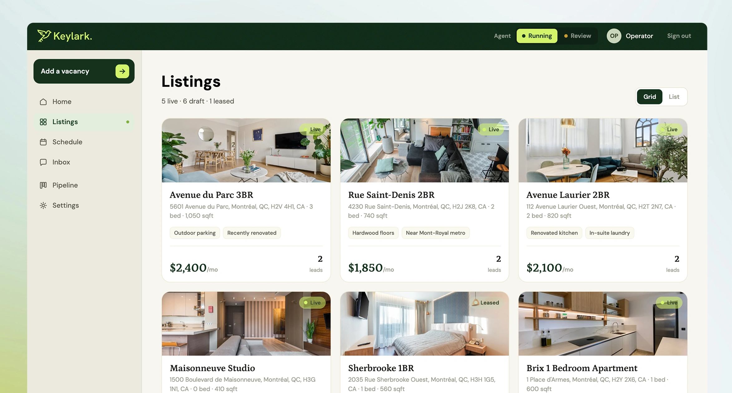
FIG 05AListings. The seeded first login: six Montréal units with real photography, so the product already looks like a working business.
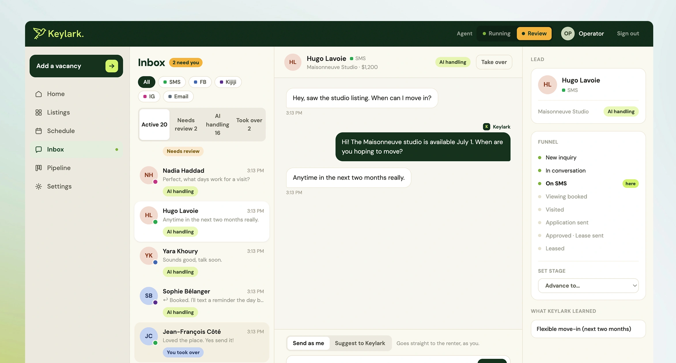
FIG 05BThe inbox, sorted by who owns each thread. The side panel shows where the lead sits in the funnel and what Keylark learned about them along the way.
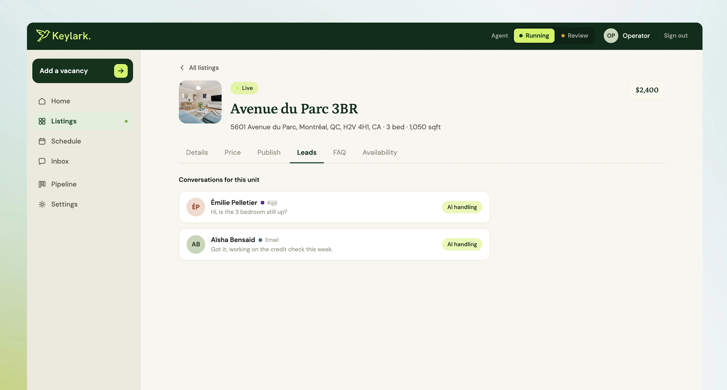
FIG 05COne unit's conversations, each showing its state. AI handling is the quiet default.
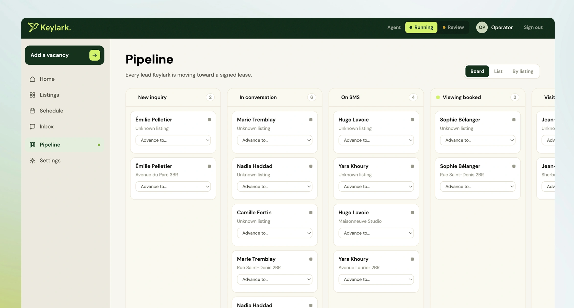
FIG 05DThe pipeline, advanced by what happens in each conversation rather than by hand.
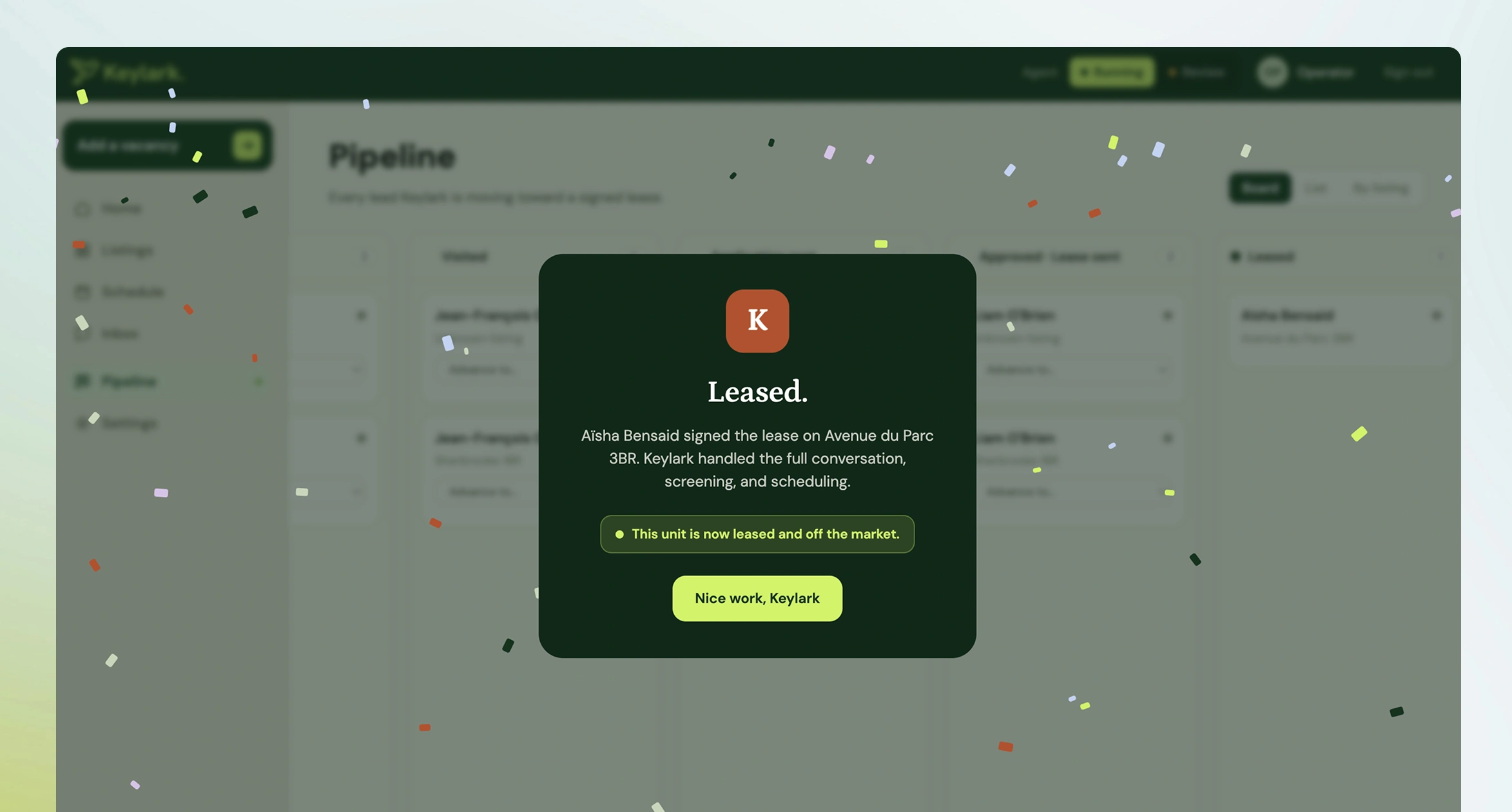
FIG 05ELeased. The one moment in a deliberately quiet product that celebrates.
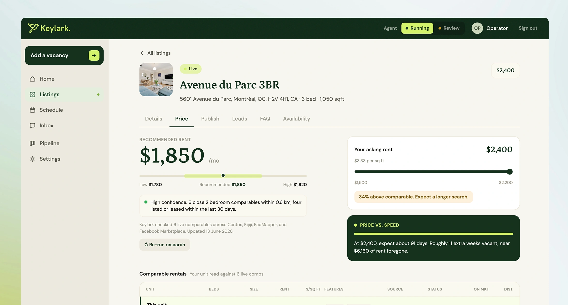
FIG 05FA listing's Price tab: recommended rent from live comparables, and what an asking price costs in weeks vacant.
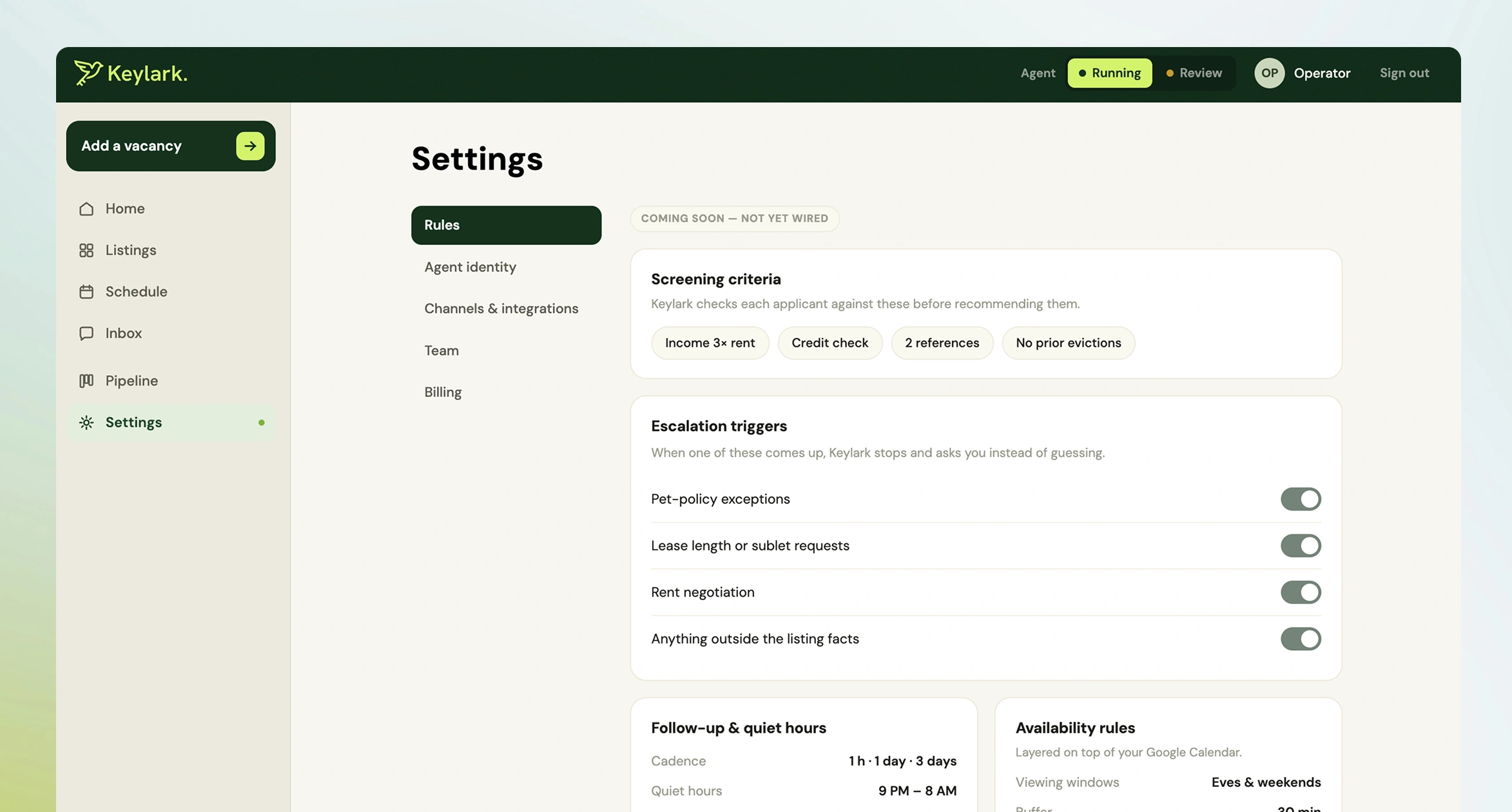
FIG 05GRules: where Keylark stops and asks instead of guessing. Designed, and labelled in the product as not yet wired.
06No API, so the design problem became uncertainty rather than access
Facebook offers no usable API for Marketplace messaging. My co-founder solved the transport. What was left to design was what happens when the system isn't sure, when an incoming message can't be confidently matched to a listing.
The rule: flag, never silently mismap. The agent may be uncertain. It must never be confidently wrong on the operator's behalf. An uncertain match surfaces to the human instead of getting a best guess and a sent reply. Same trust principle as the state model, third application.
07What happens when it's wrong
The operator has control at all times. Every reply the agent sends is visible in the dashboard, any thread can be taken over instantly, and taking over holds until they release it.
The bet: a mistake you can see and correct in ten seconds costs far less trust than an opaque system that's right slightly more often.
08Design in the running product, not in mockups
After the initial concepts I moved iteration into the live app, in a build, look, refine loop with Claude Code. To make that loop fast, the whole system runs offline with zero credentials, on a deterministic mock LLM and simulated SMS sharing the production code path. I could trigger any conversation state instantly and judge the real interface, with real data shapes, in seconds.
Static mockups lie about products like this one. The design is the behaviour: how a draft appears, how an escalation interrupts, how a stage advances. Behaviour can only be evaluated in motion.
I also wrote doctrine documents encoding every architectural and design rule, so my decisions carried across sessions instead of being re-litigated each time. In effect I designed the collaboration as well as the product.
The brand and the site
The brand direction, art direction, graphic design and UX were all mine: the identity, the marketing site and the console. One hand across all three is why the site's promise and the product's behaviour sound like the same company. The site sells calm, and the console is built to deliver it.
FIG 06 ONE SYSTEM, THREE SURFACES
The site and the console share one vocabulary, used at different volumes.
Forest
The brand, and anything that carries trust: the console header, the headlines, the leased moment.
Lime
Action and the agent at work: the Running switch, AI handling, primary buttons on dark.
Terracotta
Editorial emphasis, used sparingly: categories, links, the Leased mark.
Cream
The paper. Warm rather than white, so a busy screen still reads as calm.
Periwinkle #C3D2F2
The operator's own voice: You took over, and replies sent as you.
Lavender #D6C4E6
Decoration only, on blog category tiles.
Sage #C9D6BB
Decoration only, on blog category tiles.
PETRONA, THE VOICE
Leased.
Headlines, pull quotes, and exactly one moment in the console: the unit that got leased. The celebration speaks in the brand's voice because it is the only screen meant to feel like one.
DM SANS, THE INTERFACE
AI handling · Take over
Every state, label and control. Status reads as information, never as tone, which is what an operator deciding whether to step in needs.
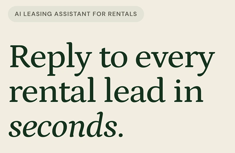
The site speaks in Petrona, forest on cream.
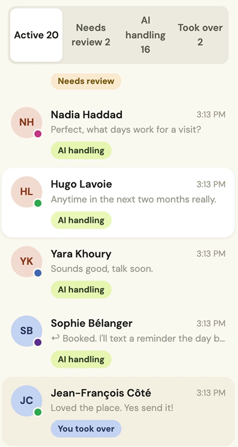
The console speaks in DM Sans. Lime is the agent; periwinkle is you.
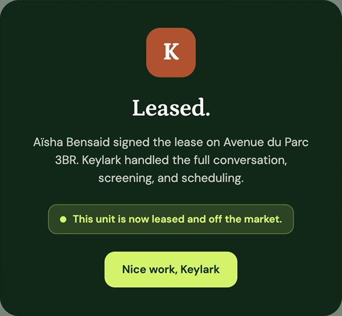
The one place the console borrows the serif, on forest, with terracotta and lime.
FIG 07 6 IMAGES, SWIPE OR USE THE ARROWS
01 / 06
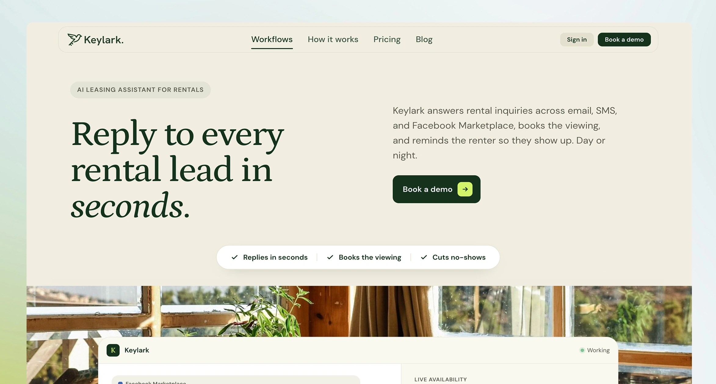
FIG 07AThe promise in one line, with the product answering a real-looking inquiry underneath.
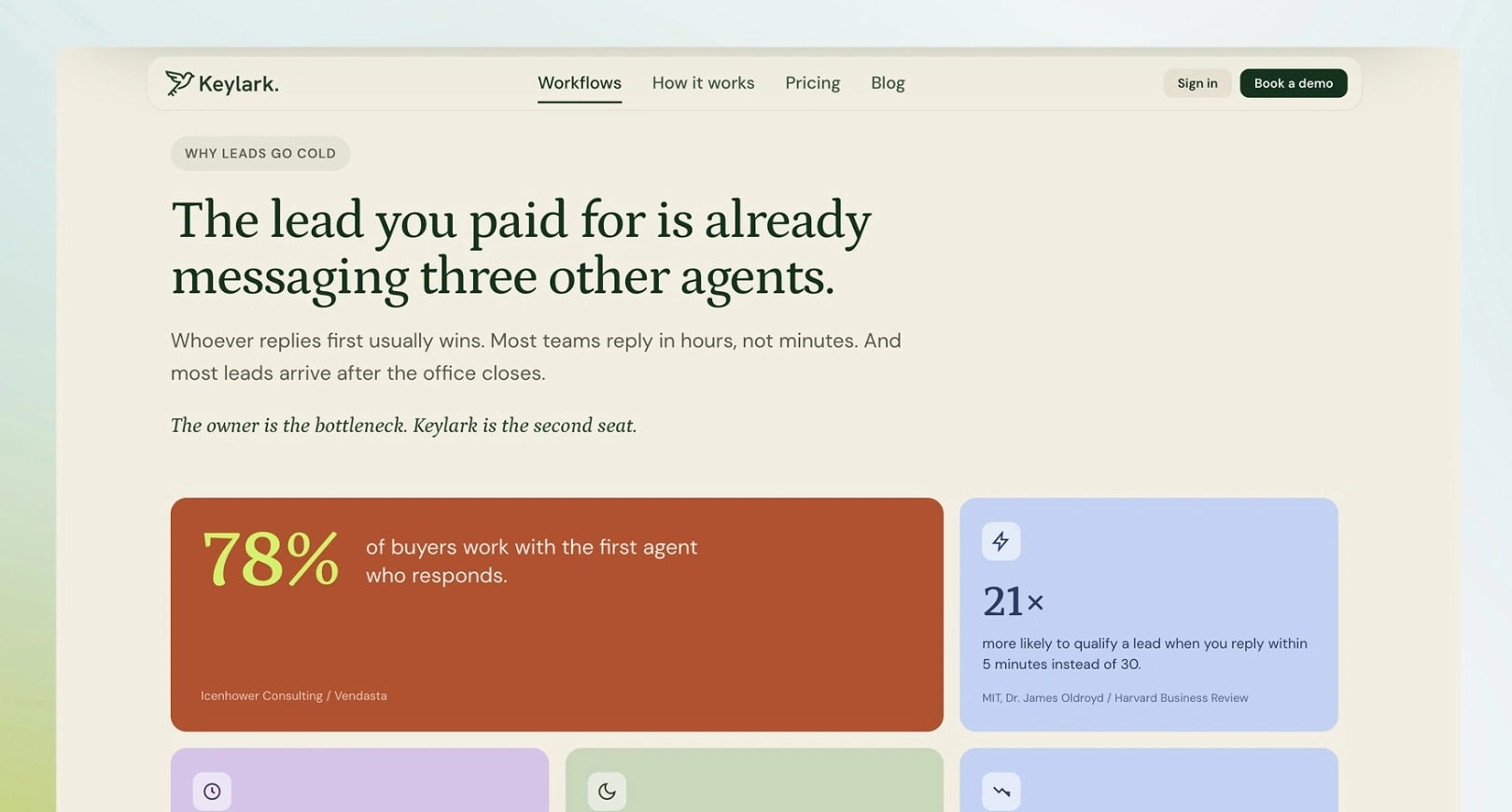
FIG 07BThe problem, argued with sourced numbers rather than adjectives.
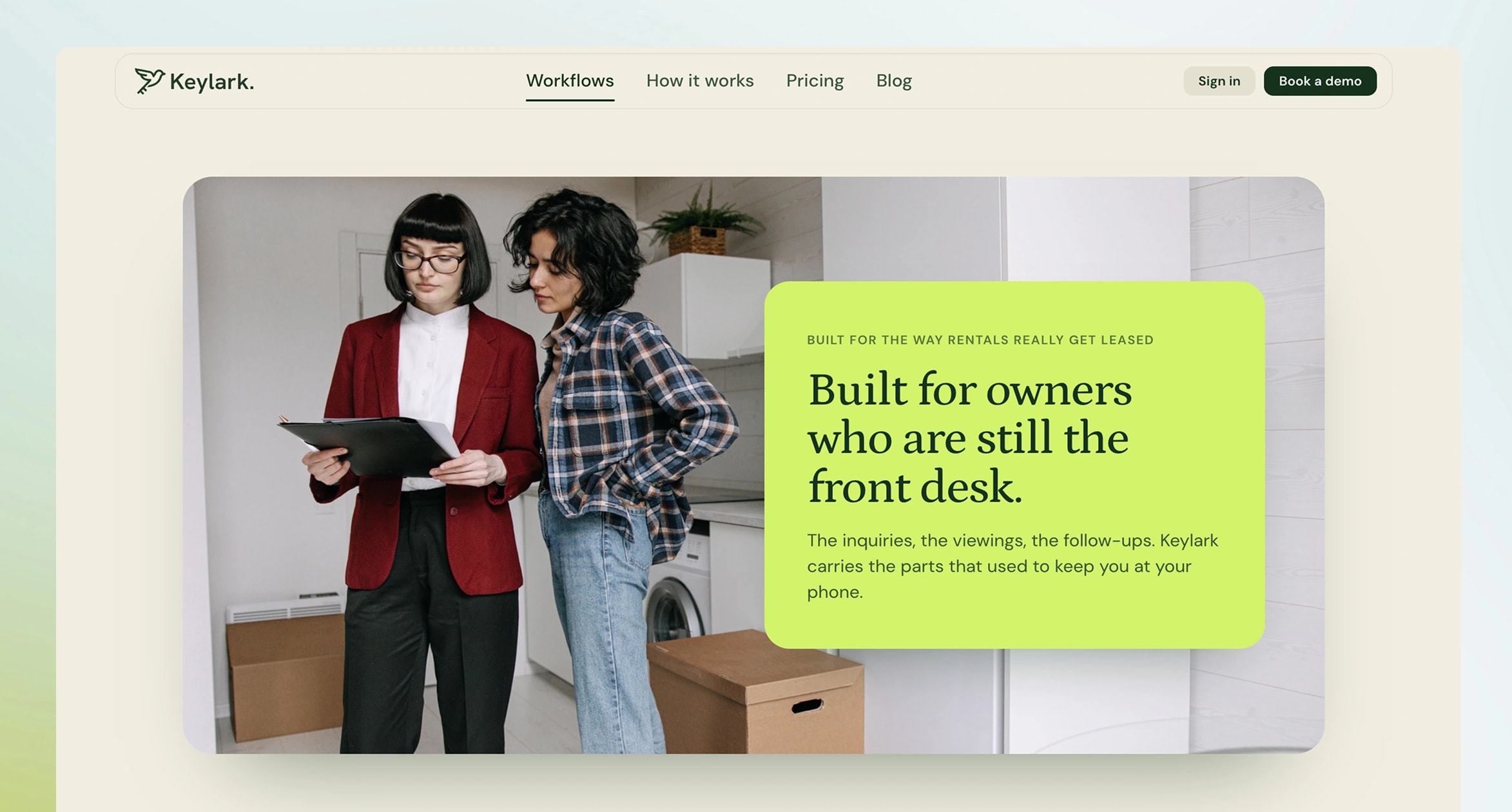
FIG 07CWho it's for: owners who are still the front desk.
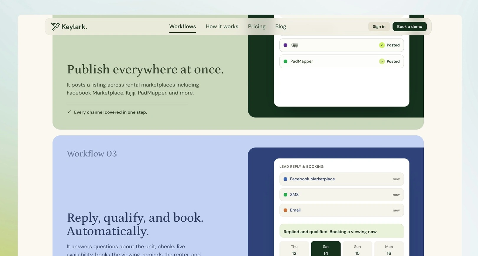
FIG 07DWorkflows, one per job the owner hands over.
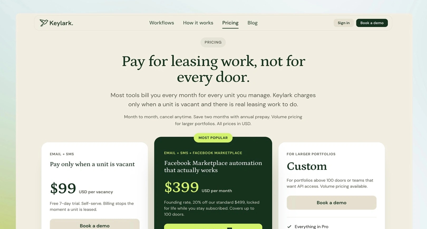
FIG 07EPricing that charges for leasing work, not for every door.
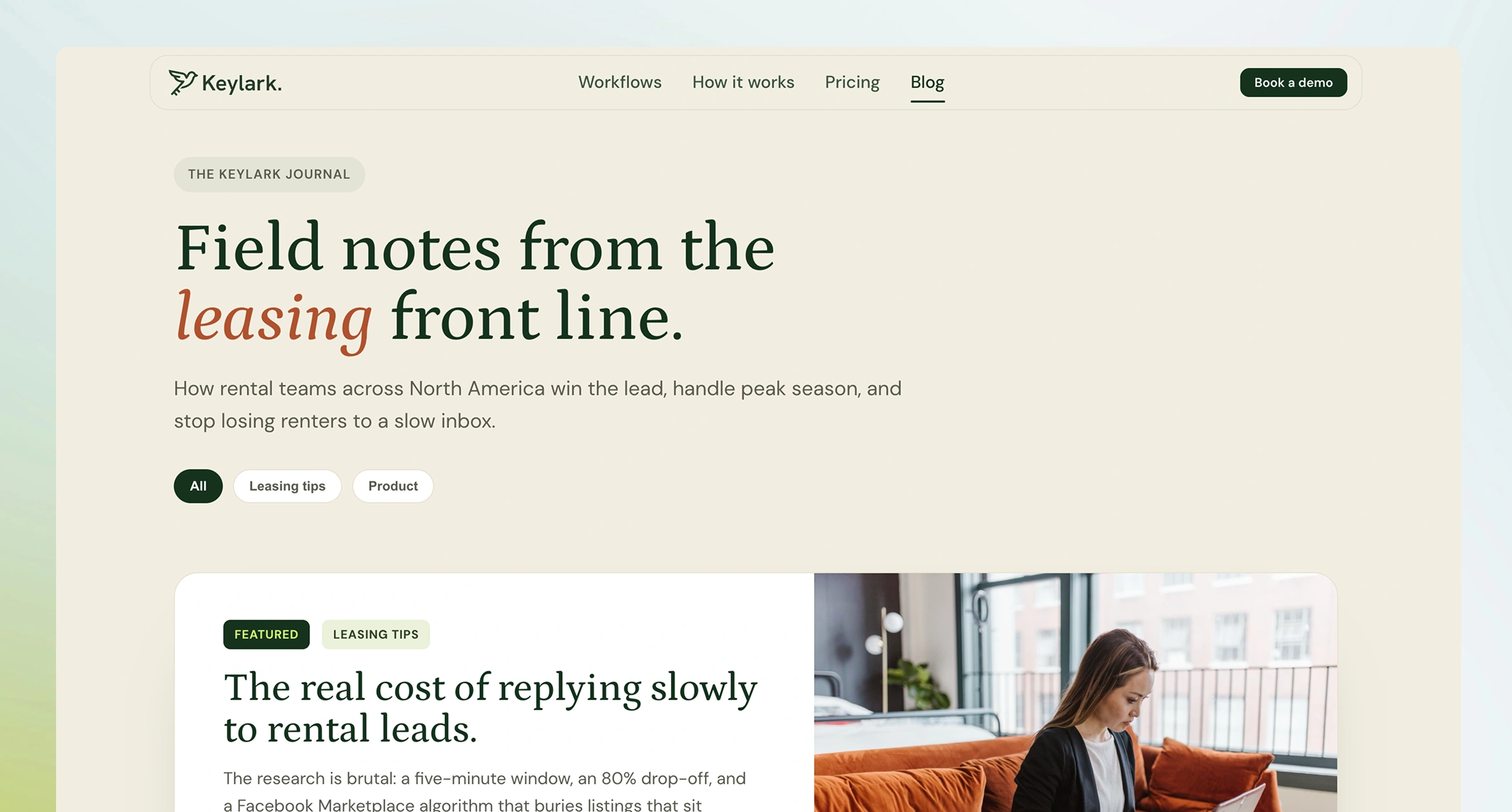
FIG 07FThe journal: field notes for landlords, led by the argument the product exists to answer.
What I would do differently
The whole design bets that operators move from Review to Running on their own once they trust the agent, but we didn't instrument how quickly they did. If I did it again, I'd track that first.
Reflection
Autonomy is a gradient you let the user climb, not a feature you enable. Review mode is the on-ramp rather than a safety fallback, and the user drives up it at their own speed.
Silence is a material. The hardest and most valuable thing I designed is what doesn't appear, and subtractive work is harder to defend in a review than additive work.
When your collaborator is an AI, writing is designing. The clarity of my specs and doctrines set the ceiling on the quality of the product.