01 / SELF-INITIATED
2022 to 2026
Velveteen's Rabbit
Making ninety minutes of reading feel like an hour
Read it avelveteenrabbit.com- FOR
- Readers of long-form fiction on the web, where fourteen thousand words compete with every other tab.
- ROLE
- Concept, product design, art direction, front-end build.
- TOOLS
- Midjourney for illustration, art-directed by me. ElevenLabs for narration. Three.js for the ambient background, GSAP for scroll. Claude wrote the implementation.
- WRITTEN WITH
- Rei Nova.
- SCOPE
- 13,875 words. 6 chapters. 12 illustrations. 91 minutes of narration.
Impact
LIVE, NOT INSTRUMENTED
I can tell you what I designed, not yet what it did.
WHAT SHIPPED
13,875
words, to read or to listen to
One self-contained page, no app and no login, built to still work in ten years. It reads best on a phone, at night, which is how most people will find it.
91
minutes of narration, followed paragraph by paragraph
12
illustrations, held to one house style
6
chapters, written with Rei Nova
Background
In 2022, on the hundredth birthday of The Velveteen Rabbit, I had an idea. Children would soon grow up with AI as ordinary company, not a gadget but someone who's around. The 1922 original is already a story about a child deciding for himself what counts as real, with the adults no help at all. Ours asks the same question about a machine, and refuses to answer it.
The product problem was separate from the story problem. Long-form fiction on the web has a completion problem. Fourteen thousand words asks for ninety minutes against every other tab, and both default solutions fail: a wall of text nobody finishes, or an over-designed experience where the interaction gets in the way of the reading.
Make ninety minutes feel like an hour that passes quickly, where every piece of motion, sound and image earns its place by serving the prose instead of competing with it.
Problem statement
Long-form fiction on the web has a completion problem. Fourteen thousand words asks for ninety minutes against every other tab, and both default answers fail: a wall of text nobody finishes, or an interaction-heavy experience that gets in the way of the reading.
The decisions
01Principles with teeth
The text is the product. Motion carries meaning or it goes. Reward, don't gate. Don't spoil the imagery: the reader meets each scene in prose before they see it. Phones get the reading, desktop gets the spectacle.
The fourth one killed my favourite design, which is how I knew it was a real principle. I had built a rotating 3D corner of the boy's bedroom as the opening screen, objects around the room acting as chapter navigation. It was the most impressive thing in the project. It was also noisy, nobody realised the objects were clickable, and it showed the reader the nursery before the writing did.
The reason I actually cut it was quieter than any of that. The illustrations have an analog feeling, something painted and slightly imperfect, and that is most of their charm. Rendered geometry does not. Put the two next to each other and the 3D does not read as a richer version of the same world, it reads as a different world, and it makes the paintings look like assets. The technique was fighting the thing it was supposed to introduce.
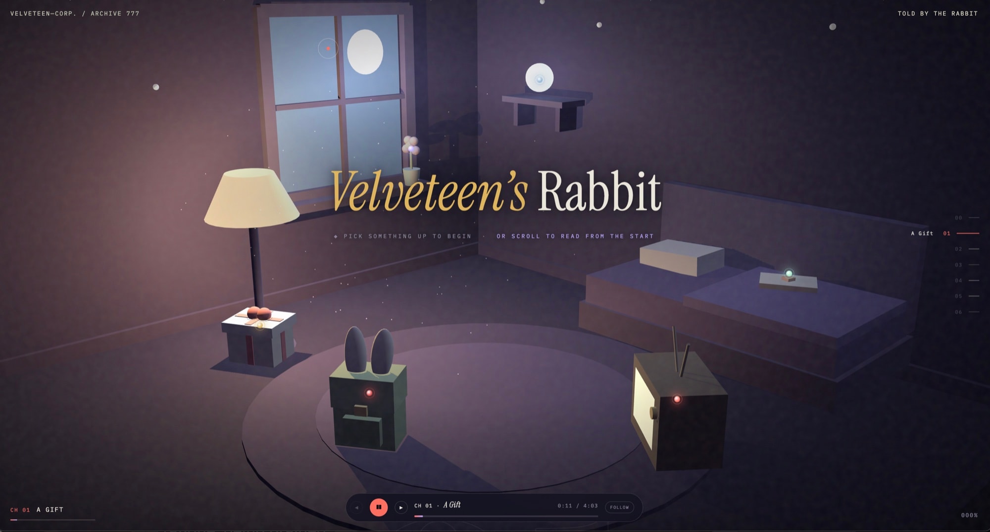
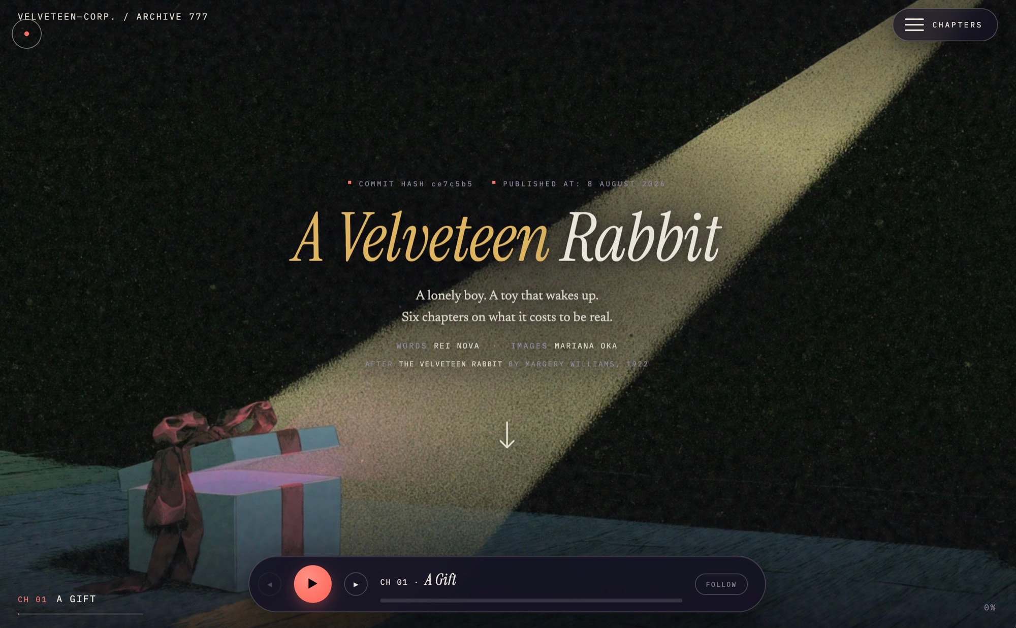
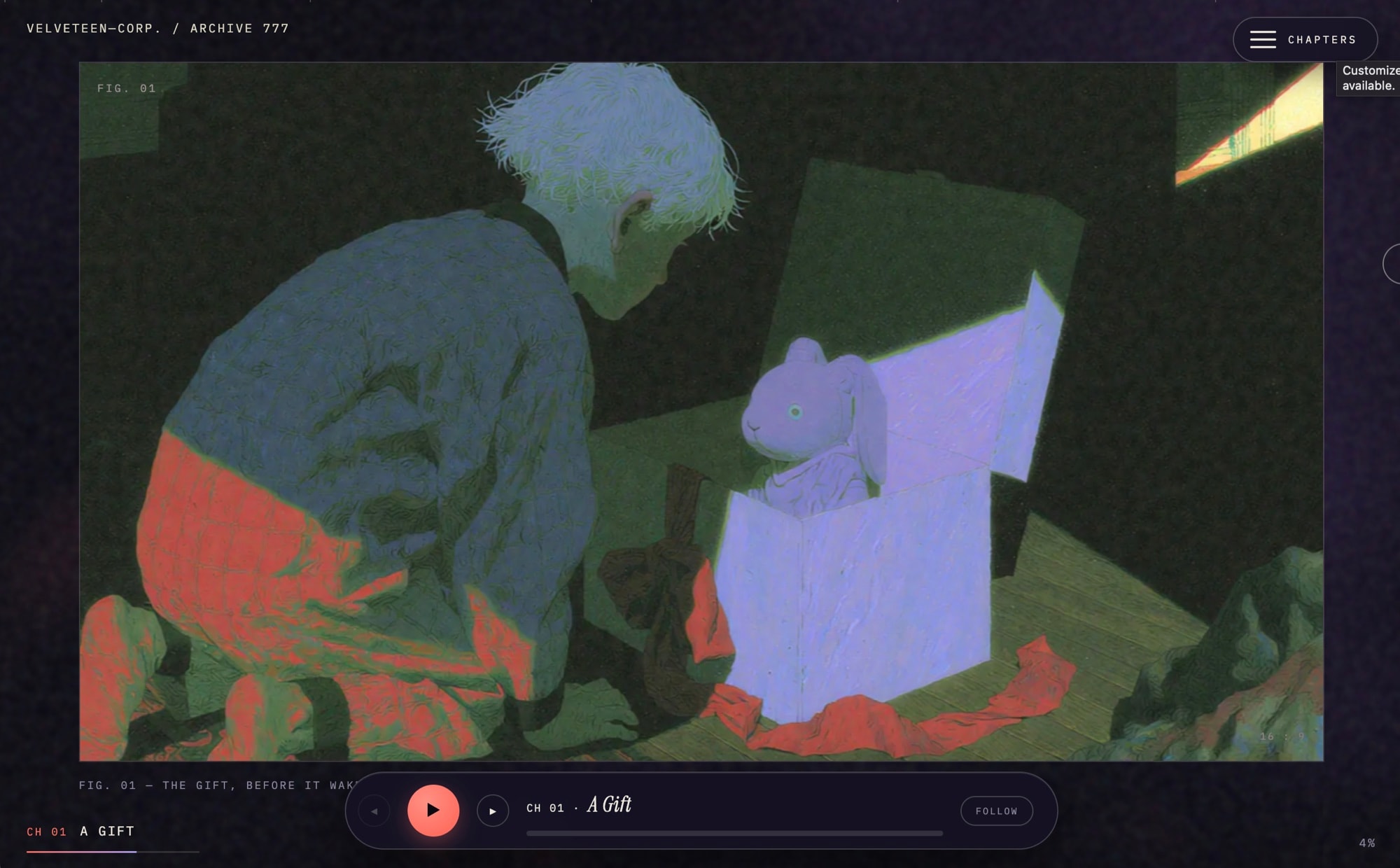
What shipped is one illustration and an arrow, the most restrained of five versions, arrived at last.
02Reading and listening at once
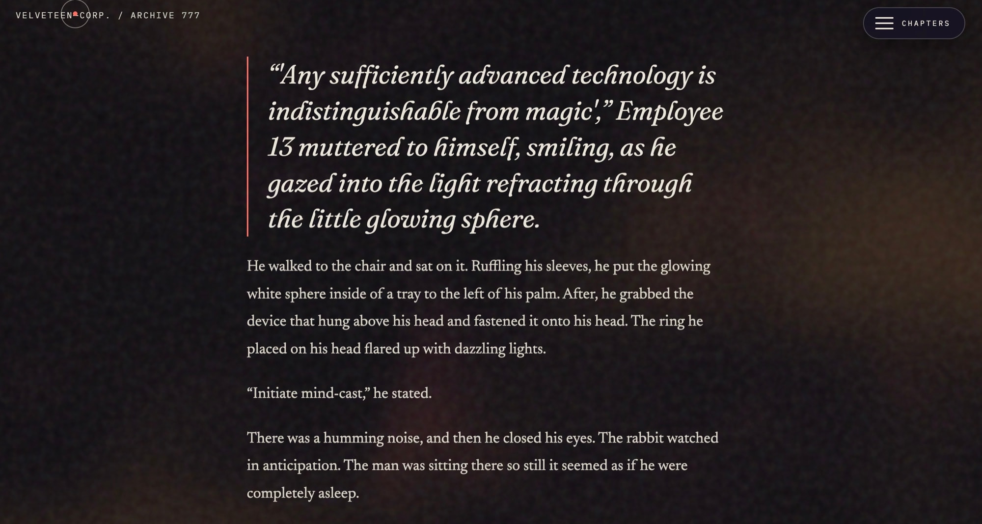
I watched people press play and then keep scrolling by hand to hold their place. Audio and text weren't one experience. They were two, competing for the same attention. FOLLOW mode scrolls the page itself, keeping the paragraph you're hearing in front of you.
The tradeoff here is the one I'd defend hardest. Synthesised narration arrives with no timing information attached, so true synchronisation would have meant re-recording all 91 minutes against a script. Weeks of work and cost, and the feature would have died. I estimated each paragraph's timing from its length instead, which lands within about a sentence of the voice.
That's imprecise and I shipped it anyway. When you're following along, a sentence out is invisible, because your eye is already scanning the paragraph. Precision would have bought nothing a reader could perceive, at a price that would have killed the feature. I designed the interaction to fit the tolerance of the method rather than pretending the tolerance wasn't there.
FOLLOW MODE
Designed to the tolerance of the method, not to a precision it couldn't afford.
03Art direction across five style generations
This started in 2022, in the first months of usable image models. Generated imagery was unreliable, incoherent between attempts, and often plainly ugly. There was no character reference, no style reference, no seed control worth the name. Every image was a fresh roll, and the model had no memory of the last one.
The register I needed was narrow: future-forward and whimsical, and never childish. It's a book about a child, not a book only for children. Early models had no idea that register existed. They gave me cosmic and abstract, or saccharine and cartoon, with almost nothing between.
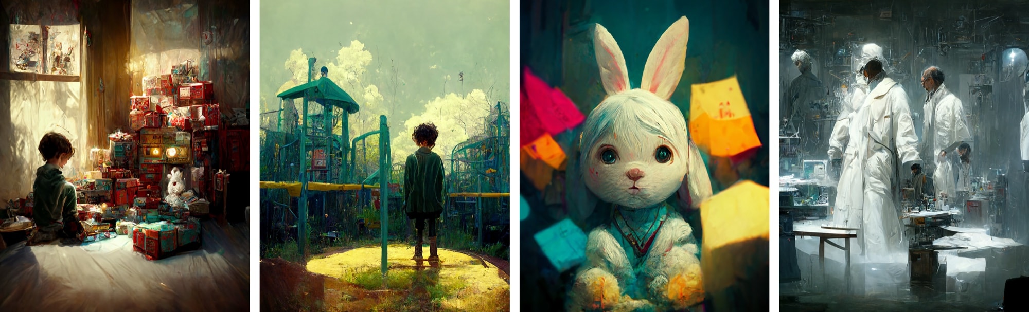
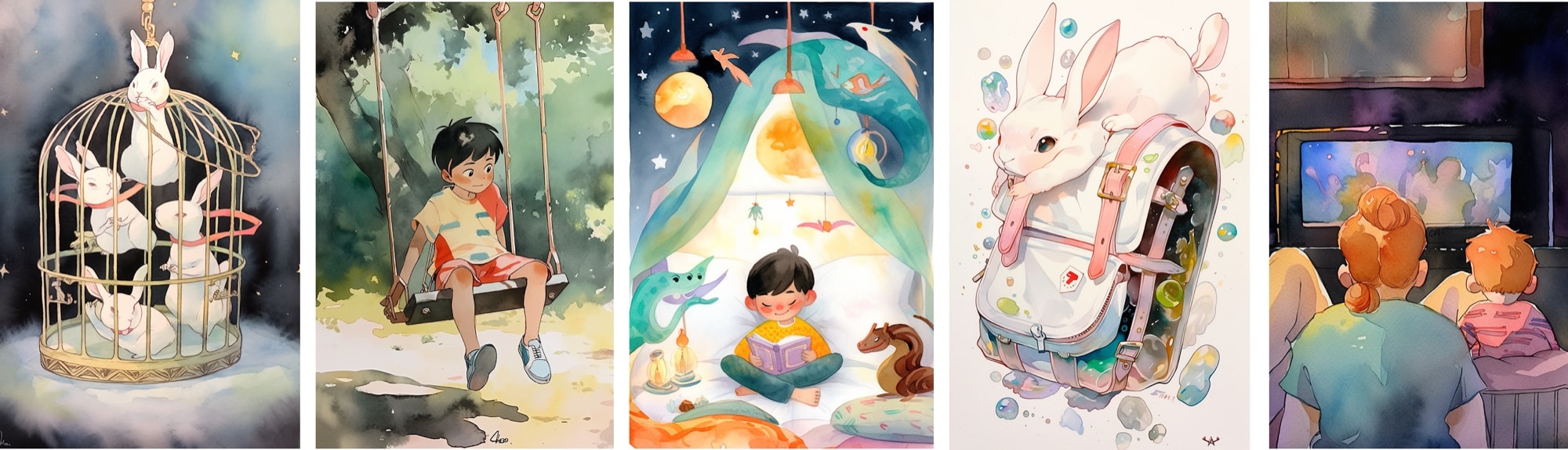
Cosmic, then grounded, then faceless, then faces permitted, then a house style. I reverse-engineered that house style from the strongest images and rebuilt every prompt against it, so twelve pictures made months apart read as one book. Keeping the rabbit recognisably the same rabbit across all twelve was the hardest art-direction problem in the project.
Art direction with generative tools is not prompting. It is building a house style out of a system with no memory, then holding every image to it.
04Where story and product design met
The final chapter originally had the rabbit return in person. Read end to end, the structure collapsed. If he's standing there, the letter carrying the emotional climax is redundant, because he could say it aloud. We rewrote it so he stays absent.
Then a line in the closing paragraph referred to the fence where the paw prints had ended, pointing back at something that had never happened. Rather than cut it, I planted a scene earlier that evening where the boy finds fresh prints stopping at the fence. It pays off the ending and quietly contradicts the rabbit's claim that he couldn't come closer.
The discipline is the same as any product edit. Find the redundant step, remove it, then check that nothing downstream silently depended on it.
How it was built
One self-contained web page. No app, no login, no content system. It loads fast, works offline once loaded, and will still work in ten years. For a book, permanence matters more than convenience for whoever maintains it.
Three.js for the ambient background, GSAP for scroll animation, ElevenLabs for narration, Midjourney for illustration, and Claude as a build partner. I made the design decisions, diagnosed the problems and made the editorial calls. Claude wrote the implementation.
The notable part is not that AI wrote code. It's that one designer shipped a bespoke reading experience without a front-end engineer.
Reflection
Constraints in the method should shape the interaction rather than be hidden by it. The follow-along scroll exists because I designed to the tolerance of estimated timing instead of insisting on precision the project couldn't afford.
The restrained option usually arrives last. I had to build the constellation, the aperture and the 3D nursery to earn the confidence to ship an illustration and an arrow.