06 / UNITY
2020
Unity for Humanity Summit
Unity's first virtual conference for social impact, designed in two and a half weeks
- FOR
- Leaders, creators and organisations working on social impact, meeting online in the middle of a pandemic.
- ROLE
- Product designer. Research, the event platform's design, the landing page and signup flow, and QA on the build.
- TEAM
- A project manager, two copywriters, an art director, a graphic designer, the events team, and an overseas development team.
- TIMELINE
- Two and a half weeks.
- TOOLS
- Figma, InVision, Pendo, Slack.
- OUTCOME
- 10,000 registrations, more than 60% of them attending at least one session, and 250 applications to the Unity for Humanity grants.
Impact
HELD OCTOBER 2020
Unity's first virtual summit for social impact drew an audience that stayed for the sessions.
THE NUMBER THAT MATTERS
60%+
of registrants attended at least one session
Registrations measure marketing. Attendance measures whether the event was worth turning up to, which is the part design could move.
REGISTRATION AND WEB ANALYTICS
10K
registrations
250
applications to the Unity for Humanity grants
32%
more registrations after signup was rebuilt for mobile
WHAT IT BECAME
The summit has been part of Unity's events every year since. Success had been defined before launch: registrations and attendance, post-event feedback, attendees who went on to download Unity, and the reach of the event itself.
The brief
Unity for Humanity supports creators using real-time 3D for social impact. In 2020 its summit had to move online, for the first time, and Unity needed a virtual event that leaders, creators and organisations would actually show up to, learn from and connect at, while bringing the Unity for Humanity grants to a much wider audience.
It had to be ready in two and a half weeks, on a customised third-party event platform, built by an overseas development team, with the brand, copy and events teams all working in parallel.
Moving an event online is easy. Making people want to stay is the design problem, and in 2020 everyone was already exhausted by screens.
Problem statement
Unity needed its first virtual summit for social impact live in two and a half weeks, for an audience already exhausted by screens. It had to be worth staying for, not just registering for.
What people wanted from it
I interviewed people who attended online events about the last one they went to, what made them choose it, how they rated past events and what frustrated them. Three findings shaped everything that followed.
They expected to take part, not just watch. Technical problems didn't only spoil a session, they soured the whole event and made people less likely to choose a virtual one again. And above all they wanted to meet people. The people I spoke to were about twice as likely to attend an online event if it helped them build professional connections.
That turned the brief around. A summit online is usually designed as a broadcast with a schedule attached. The research said the schedule was the reason to come and the people were the reason to stay.
THE REFRAME
Designed as a room, not a broadcast.
The decisions
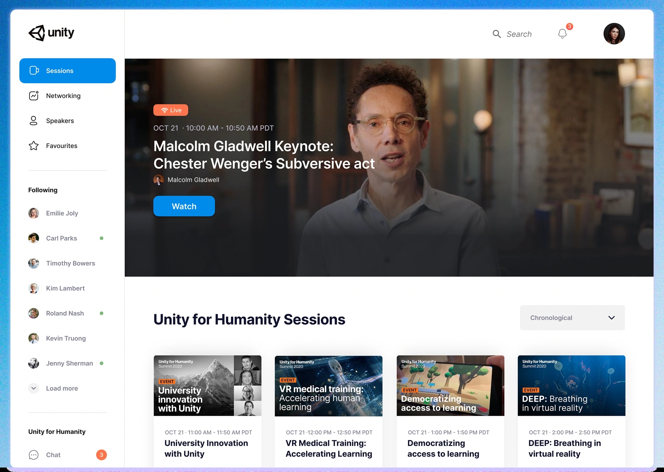
01Networking is a destination, not a sidebar
Sessions, Networking, Speakers and Favourites sit at the same level in the navigation. The people you follow stay in view on every screen, with a dot for who is online right now, so a conversation is always one click from whatever you are watching.
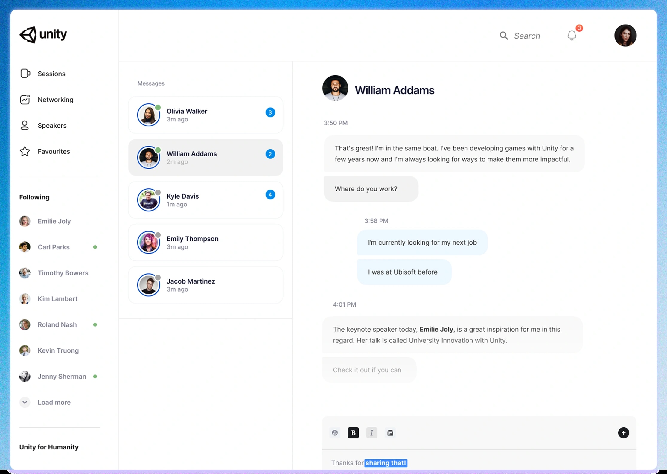
02The conversation happens where the talk is
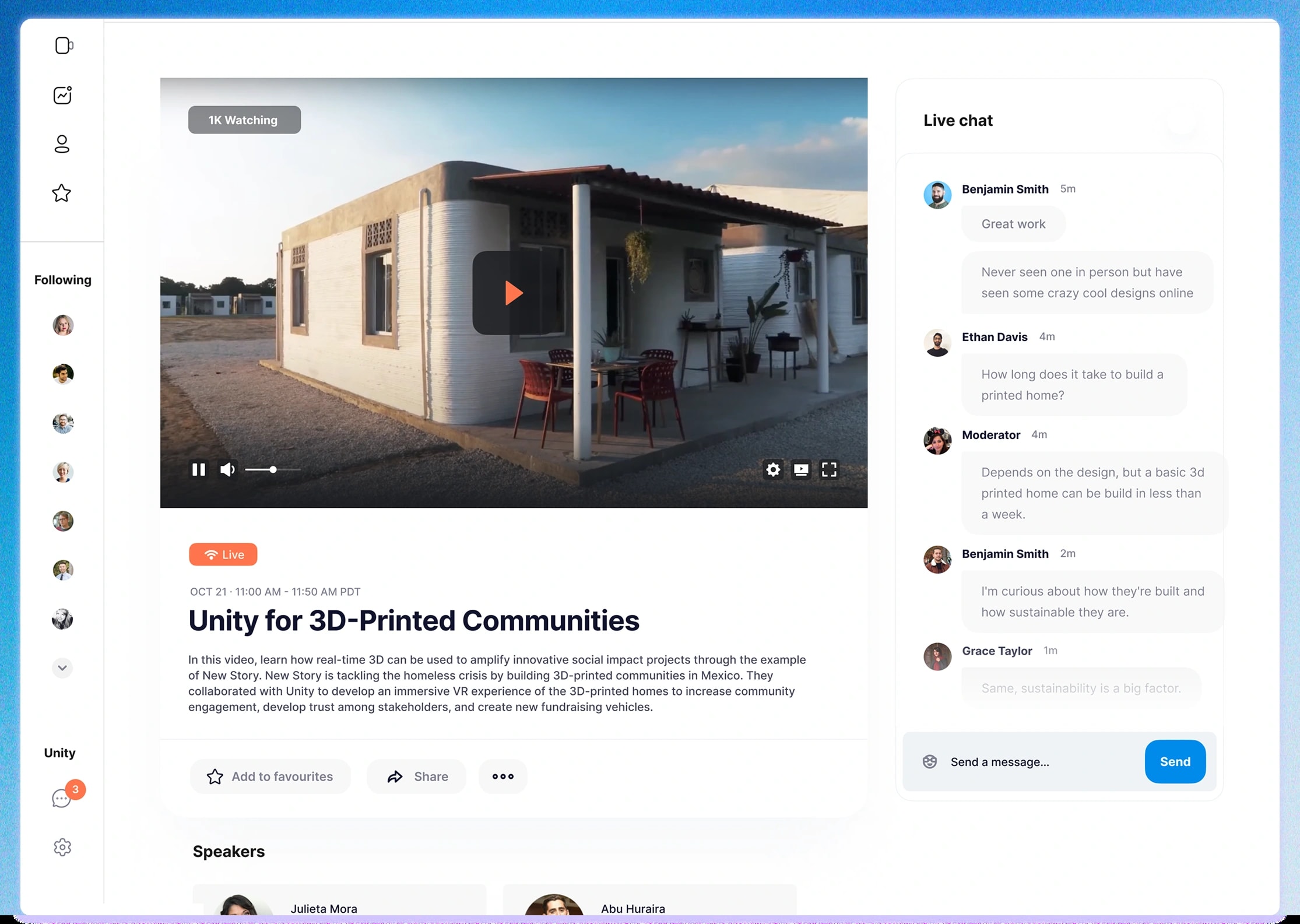
Each session pairs the stream with a live chat beside it, so reacting to a talk doesn't mean leaving it. A moderator is present in the room. For an event about social impact, a space that stays civil is part of the product, and the brief asked for it to be safe.
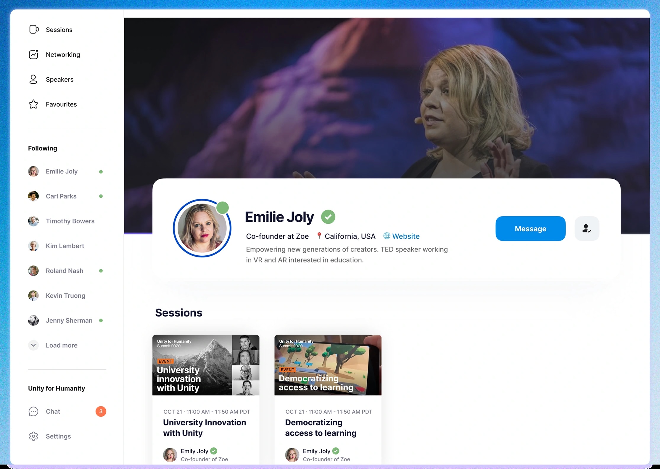
03Speakers are people you can follow
A speaker page is a profile, not a biography: who they are, a verified mark, their sessions, and a button to message them or follow them. Following turns a talk you enjoyed into a connection that outlasts it, which is the thing a physical event does without trying and a virtual one has to design for.
04Designed to be built in time
Two and a half weeks with an overseas team left no room for a design that had to be explained twice. I built a compact design system for the platform, so every screen was assembled from the same small set of parts and questions could be answered by the system rather than across time zones. Signup got the same treatment: rebuilt for mobile, it lifted registrations by 32%.
What I would do differently
Connections made at the summit had nowhere to go once it ended. I'd design a follow-up, such as keeping who you met and the sessions you saved, so the network outlasted the day.
We tracked registrations and attendance, but not how many connections people actually made. Since connection was the reason people came, that's the metric I'd add.
Reflection
The research changed the product more than the schedule did. An event built as a broadcast would have shipped on time and emptied out by the second session. Treating connection as the reason to attend is what kept people there.
Speed was a design constraint, not an excuse. A small system, agreed early, is what made two and a half weeks enough.